This assignment was called Empirical Evidence and for this it was all based around location photography which I something I feel I am good at, compared to studio photography. After looking over all the different topics we can do I was going to photograph the everyday life, but after a little bit of thought I decided against this and decided to photograph the unconventional, the "boring". My plan for this project was to go out to a wide range of locations, those that wouldn't normally be used to take photos in. I went to a range of different unconventional areas and made sure that the images were not just unique but also unconventional which is exactly what they were. The sorts of things that I photographed during this assignment are bike locks, different angles on street signs and just random items that I see when out walking on a shoot.
The idea of photographing the everyday life changing to the unconventional after I researched William Eggleston and truly became inspired by his work and felt that this was the type of photography that I wanted to do during this assignment. I would also say that Shin Noguchi's work inspired me as well as a fair bit of his street photography is quite unconventional. Throughout most of the project I used my flash on the images to give them the bright effect, I also used a narrow depth of field on the images to allow you to focus more on the actual thing that I am photographing instead of the background
Throughout the project I constantly was happy with each and every photo shoot I did. I did think that my first photo shoot that I did was actually one of the best photo shoots probably the second best after one at St. George's Park. I don't really think I had any major problems when I first went out there were a few minor tweaks that had to be altered a little bit, this did prevent me early on from taking just one shot of each item I shoot, most of the project I did just take one shot of each item.
When I look back at my final piece I am quite happy with how it came out, I do think though that if I had done another photo shoot I could have maybe got a couple of better images. The images I have are decent images and strong though I do think that extra shoots would have given me 4-6 I could have used in the final piece that would have been really strong images, a lot stronger than any other that I had produced in the project or any other.
Overall I would say that everything came out quite well there would be a couple of minor things that I would have tweaked but truly that isn't a major problem so that is a bonus really. Some of my images that I took during this project are really strong and powerful and some of my best images. I could easily see some of these images that had been taken during this assignment going into my portfolio which to me does say that I have managed to get great photos during this assignment. This has definitely been a strong assignment for me in terms of my actual photograph.
Friday 12 December 2014
Final Image
When it came to choosing my final images I wasn't too sure which images I wanted to use. At first I decided how many images I was going to use, I already knew that I was likely to put them all on one sheet. After deliberation I decided to use four images. I straight away knew one image that I was going to use the bike lock, that was a simple choice I had known for a while that I was going to use as one of my final images. Choosing the other three images was probably the hardest part I made sure that I took my time choosing these images and looked over all of my images to ensure that I chose the best three images. After looking over all of my images taken on this project a couple of times I found the other three images, all of which I am quite proud of as I do feel that they are strong images.
Originally they were going to be half black and white and half colour though after the critique I decided to have them all in colour mainly due to the fact that I don't really think the bike lock image looks very good in black and white.

My location communication
What I am really trying to communicate with my locations and images is that you can never run out of places to photograph and that you can go to some of the strangest places and still be able to get some really strong images. This is exactly what I have tried to do throughout this project, I tried to go to some of the most unusual places to try and get some really strong and different images, which is what I believe I had managed to do throughout the last couple of weeks.
I have managed to communicate this by making sure that I went to a wide range of different locations and trying to get as many different images as possible. I was also trying to make sure that the images were really different and in no way similar which with these final images I believe I have managed to achieve this in these images. Not just in my final images, but in all images I have managed to shoot in many different locations and ensure that all the images look completely different and show a wide range of locations.
Overall looking at all the different locations that I have used have in my opinion been a really good choice and there is definitely a wide range of locations chosen which is something that I am really happy with and how the shots came out.
Thursday 11 December 2014
Critique Feedback
In the critical feedback main things that were raised were that the focus and exposure on the images which I am really pleased that it was considered some of the strengths as these were two parts that I had focused on making sure that they worked really well when I was taking the images. An improvement that was raised was choosing between having all my images in colour or all in black and white, I admit putting two in colour and two in black and white was a bit of a gamble which clearly hasn't paid off. So because of this I will have all of my final images in colour and not in black and white as all of the my final four images don't really look very good in black and white whereas they all look good in colour. One other point the group raised was not sure of the concept, yet at the top of the feedback they mention what the concept is which is strange to try and pull it up as a improvement so really that wasn't needed. It was clear when it came to the final improvement they were looking for anything to put when it says shoot more when all that was required in the critique was final images which I presented. If the group had wanted to sell all of my other photographs that I had taken during the project to try and find improvements that way they should have asked. They have also said that my images are photographing the banal and boring which is what my images are which yet again is the concept of the images, I feel they were just looking for something to add as they were clearly struggling.
Comparisons in research work and mine
The main difference between the locations of my research artists and my own is that they incorporate the street into their photography. I have been actually taking them out on the streets but haven't incorporated the streets into my images. The only person in my research that my images are quite similar to and that it is clear that I have drawn a lot of inspiration from is William Eggleston. I have tried to incorporate bits from each research artist that I have looked at into my work, but I am not that sure whether much of the work has come from each research artist.
The research artist have used people in practically every shot, except William Eggleston contains a lot of people. The work of the research artists varies between colour and black and white, so because of this two of my final images will be in colour and two will be in black and white. The location in the research doesn't really change much most of the work is set around the same town or city, which is what I have done all of my images have been taken in Burton despite opportunities to go to other locations such as Derby I wanted this to be the same as the research artists.
Almost every research artist has black and white images, but for me some of my best images they didn't look that good in black and white. I tried to mix it up but I don't think it went down to well so that won't be something I will be doing again.
Choosing the final images
When it came to choosing my final images I felt that I had a fair few images that I could choose from. Even before I decided to choose my images, I knew of one that was definitely going to be one my final images.
 When it came to choosing my first image I knew straight away which image I was going to choose, the image of the bike lock in the leaves. This was chosen straight away because this is one of my favourite images that I had taken during this project so I knew instantly that it was going to be chosen, there were a few people who I had spoken to as well who liked it which meant, that without a shadow of a doubt this was going to be used as one of my final images.
 When it came to choosing the second image to use as a final piece I did have a couple in mind, but the one I chose was the more basic street sign this was chosen because it shows the top of the sign with the swan on and the part of the sign indicating where a certain place is, is clearly visible and readable despite being at the angle it has been taken at. This was a clear indicator to me, to choose this one. I also liked how the image didn't just have the white background of the sky but of the trees as well.
 The third image I chose was the one of the metal book on the bench covered in rain water. This image was chosen because I liked the effect it gave when covered in the rain, there is one part of it that isn't that readable, but one section of it is readable. I still think that this is a strong image though had the second part of the book been completely readable it would have been a really strong image as quite possibly one of the best images that I had taken over the project. Had the image not been taken from over the top, it may have come out perfect, but despite this I still like the image which I do believe is a strong image.
 The fourth final image I chose was the one of the goggles in the twigs and grass, this was chosen because I felt that the image look quite good as the goggles had just been moved out of shot in a completely different image unrelated to my project, but I felt where it had been accidentally positioned looked really good. I do think it is quite a strong image and easily beat the one of the leaf that I was originally going to choose as a final image.
Wednesday 10 December 2014
Location Choice
When it came to the locations, I wanted to go somewhere where I knew there was likely to be a fair few images. This wasn't a specific location, but all over the area, there were plenty of opportunities in every single shoot.
 When I set out on my shoot I didn't have a specific location in mind I just went out to shoot unconventional items. I had a rough idea of the location but not a specific location I kind of wanted to go to places where there is likely to be a fair few unconventional items and really around Burton there are quite a few of these locations.
The location for the first image was chosen as it was normally a quiet area and it was quite unlikely that around this time that there would be anybody sat on this bench and thankfully there wasn't.
 The location for this image was chosen because this was almost always going to be there as it is so rusty that it is very unlikely that it is ever going to be removed. Also where it was with the background it gave it something different in the background and doesn't just give you the lock to look at, but it isn't in focus and has used a narrow depth of field to allow it to focus more on the lock then the actual ground and surrounding location.
 This location was chosen because I knew I was likely to have a lot of objects that were easily considered unconventional and I could take image of such as this image. This image is simply bird poo on a leaf and I decided to take a photo of this as it is completely unconventional and it was likely to be something that no one would really take a serious photo of, some people may just take a photo of it for a laugh, but not how i've done it. This location did contain a lot of items that were considered unconventional.

This image was also taken in the same location and it showed that even just moving something accidentally can produce some really good unconventional images like this has done. It also shows that it was a really good location to use for unconventional photos, if someone was trying to get photos that wouldn't be considered unconventional then it wouldn't be a location that would really be used for that sort of shoot.
The location for the first image was chosen as it was normally a quiet area and it was quite unlikely that around this time that there would be anybody sat on this bench and thankfully there wasn't.
Friday 5 December 2014
Review of Photo shoots
Throughout this project to date I have gone on three different photo shoots, taking over 30 photos each time. I would say that the first shoot I did was probably the one I was most pleased with as nearly every single image came out the way I wanted to and like I had set out to do, they were taken in one shot. The second shoot did produce the most images that I could use as a final piece or even in my portfolio, but this shoot wasn't the best as there were a fair few images that weren't very good and had to be taken a couple of times before I got it right.
 The first shoot I took over 50 images, this shoot was the best as it produced a wide range of images, that I really liked. This shoot I feel went well mainly because practically every image came out right, but the second shoot I thought had more photos that I felt were strong and could be used as final images. The shoot produced the Pespi can image which is one I like as it isn't really something other people would even consider taking a photo of. I like how the can was just there on the ledge which I also found interesting. There was also a can of Dr. Pepper sat on the ledge on the other side.
 The second shoot did provide me with another 12 images, this was just a short shoot later on in the day, after the first this was just to get a couple more images. I think that even though I took just 12 images, I think easily 8-10 of them could be used as a final pieces and three or four of them could even be added to my portfolio. This shoot produced the top two images on this page, which I do feel are quite strong images. The bike lock is as there is other things to focus on besides the bike lock, and the leaves have a really good texture to them, which is kind of slimy. The water droplets I also feel is a really good image as it focus on the drops and the pole there are coming off, and not on any of the background and it has a brilliant narrow depth of field
 My third photo shoot was easily the weakest of the three, but even though it did produce several good, strong images, the level of the previous two shoots meant that they just weren't good enough. This shoot produced a further 32 images, all of which I probably would have used had it not been for the previous two shoots. The third shoot produced the bottom image, which I do like quite a bit but because of what I had produced in the previous two shoots, I am not really sure that it is on par with the other images that I had already produced for this project.
 Overall of the 100 or so images that I took I feel really pleased that I managed to produce in my opinion 60-70 strong images that I could use in this project and because of this it will make choosing my final images quite difficult, I do have in mind a couple that I could use. One I feel I may use as a final, is the top image from this page. I will also look for at least 2 or 3 more for finals I intend to go out on one or two more shoots to reach around 150 to 200 images and then I should be able to pick some final images, hopefully I may end up with four or five final images.
Thursday 4 December 2014
Photo Shoot 3
For this I continued documenting the unconventional around Burton, but this time I went to different locations so try and find a wide range of images that I could use and this shoot probably wasn't my best, but I still managed to get some pretty good images that could be used as one of my finals.
 With this image I tried to get the entire lock and get some of the detail of the rust and get some of the pole it was on as well, which I feel I did. I did give this a few more attempts, to try and get plenty of rust, but I do feel that of the others I took of this lock, this is probably the best of the three or four I took of the lock. I am quite happy with how this image came out as it has the narrow depth of field, and it focuses perfectly on the lock and pole which is exactly what I was looking for.
 This image I took when I was helping Sammy with one of her shoots, I just this cloth hanging off a branch and instantly thought that it could make a really good photo as it is very unconventional and I feel that this image came out really well. I feel that the main thing that helped this image be a strong image is the colouring of the leaves of the branch that the cloth is hanging off.
 This photo was a little bit of luck really, I was again helping Sammy with her shoot and she threw her goggles and they landed like this which I feel looks really random and out of place which I really liked. This continued a pattern of images where I just had one attempt to get the right image, which I feel I did here with the one photo and I am really glad it worked.


Laurent Roch
Laurent Roch is a multi-award winning French street photographer. Like Julien Legrand he shoots and reacts to what he sees and doesn't stage images. Again similar to Legrand he photographs the everyday but quite similar to William Eggleston, Roch looks for the unconventional in his photography.
 This first image looks like a police barricade and one random kid has decided to have a look at it. I find this image interesting because the police seem to have a barricade up for some reason, but it seems that this one kid is the only person there which I find quite strange. This is one of those images that I couldn't see in colour. When you look at the image the main things that stand out are the boy and the word police. The word stands out because it is quite big on the screen and is quite central, the boy stand out as he is quite a large figure on the screen.
 In this image it shows a man cycling past a building which has a painting of Marilyn Monroe on the side. The interesting thing I noticed about this image when you enlarge it does look like the painting is actually looking at the person cycling. This photo I do feel would look good in colour, but if the painting of Marilyn Monroe hasn't been done in colour then it is best to keep it in black and white. The main thing that stands out in this image is the painting of Marilyn Monroe because it is so prominent and covers most the page.
 This image seems quite unconventional as it looks like Roch has decided to take a picture of people using a crossing but put the camera upside down to get this sort of image. I feel that this is probably the strongest image of the three mainly because of the unconventional way the image has been taken. It is easily one that should be in black and white and not colour. The location he has chosen is really good as you are more likely to get a fair few people to cross here. I think this is not only the best of the three, but one of Roch's best images.
Julien Legrand
Julien Legrand is a French street photography who is known for a wide range of both colour and black and white images. Legrand is one of those photographers who's images are just spontaneous. He just takes his camera with him everywhere not looking for a specific image but waits for a suitable moment to shoot and regularly comes out with really strong and excellent images like those below.
 This image seems to be either the opening of automatic doors or the opening or an underground. I think that this is a really good location to use as it has the doors and you can choose whether to use them or not and with Legrand using them it doesn't focus on the people and more on the door which makes it a really strong image. This is another image which I feel looks better in black and white. You can clearly tell that there are a few people in the shot but the best thing about this image is that yes you know they are there but there is more focus on the door than anything else.
 With this image it looks a little bit like something has just exploded and the person at the front is running away from it. This gives it a more documentary look, but if the person wasn't in shot it would look like a more staged shot and not documenting the every day life. I feel that unlike the first and last image, this would probably work quite well in colour as well. It does also look like mist and the person is just casually walking past. Personally I do think that when I look close at an enlarged version of the photo, that it is just mist and the lady in shot is just walking past Legrand as he is taking the photo.
 At first look this image does look like the man in the photo is asleep but when I looked at an enlarged version of the photo, it does actually look like he is laughing, but he does look like he has his eyes closed whilst waiting for the bus. I would have at one point wondered why he would take an image like this, but know I understand fully why he would take an image like this as clearly he is documenting the every day life of what I believe is Paris. I believe that all of the images here are showing the everyday life of Paris and to me these images show a wide range of things that go on during a normal day in Paris. These images and all of his others are quite strong and show that in Paris and all the other places he has shot in have a diverse range of subjects and activities going on during a typical day.
Shin Noguchi
Shin Noguchi is a Japanese street photographer. Noguchi is based in Tokyo and Kamakura, this is where he takes a majority of his photos. Noguchi himself has said his tries to photograph the extraordinary. Noguchi is also part of the international photography group "Street Photographers"
 In this image is shows a woman crossing the road, though it just shows her legs and feet. I feel that with it clear she is in a walking motion it kind of reminds me of the Abbey Road album cover by The Beatles with the crossing on the road. I feel that this is a very strong image as it just has a focus on one part of the woman.
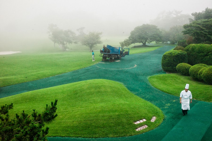 In this photo it shows a chef walking across what seems to be a golf course which makes me think that this is probably a country club. It has a very green look to it as the path is also a greeny blue colour, all the trees and bushes are also quite green and stand out and the machine in the background is a big green as well. I feel that with the mist at the back of this photo it makes it makes it a really strong image. I think that if the chef was in green as well it would be a great photo but I know that most chefs where white, but this wasn't something major that I would change.
 In this image it shows a person, which I believe is a woman walking across a path with an umbrella covering their face and most of the top half of their body. It also has a couple of shadows which are in quite interesting places as it leaves a gap between the two and then the person is in probably the best place away from the shadows. This is why I feel this is another strong image.
Friday 28 November 2014
Umberto Verdoliva
Umberto Verdoliva is an Italian photographer who is best known for his street photography, he not only conducts street photography workshops but has his own group Spontanea which is dedicated to street photography.
 In this photo it sees a person, which I believe is a woman cycling along a road. Like a lot of his images that I like it just has one person in it and a wide area of space around them. This image shows a lot of the area this person is cycling around, what I do like with not only this image but all of them is how you can just see the person as black and not any features of them are visible.
 This cycling image I feel is the strong of the two as there is more going on in the photo you can see them at the roundabout. The actual person and bike is quite small in the photo as it shows a lot of the surrounding area and all the detail of the round and the roundabout and path markings as well which I really like. This is because it is not just a boring image of someone on a bike it has a lot more to it than just a bike and cyclist.
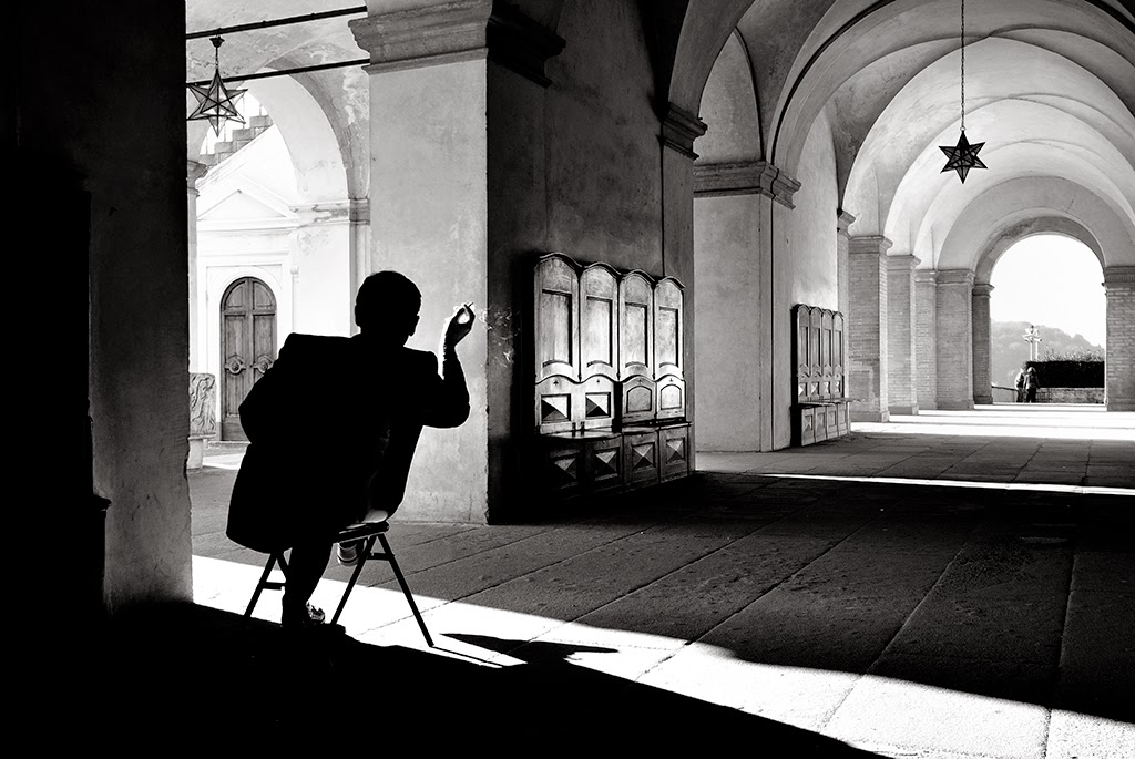 This image I also like as it just has one person sitting in a corridor and it shows the entire corridor which has a lot of detail to it. It has all the items on wall and the star hanging from the ceiling. The main thing I think people are wondering when you see this image is what is this good doing, I think that he is either drawing the corridor or maybe even having a smoke. All of the images are quite interesting and of course they look a lot better in black and white I feel than in colour.
Thursday 27 November 2014
Photo Shoot 2
In my second photo shoot I decided to not only photograph the "boring" but also test my skills on the rain drops and see if I could get a good image of them which I feel I did.


Wednesday 26 November 2014
Dimitri Mellos
Dimitri Mellos is a Greek photographer who is known for his street photography. Mellos would run around town pretending to take photographs when he was young, by using a camera not loaded with film.
 In this photograph I feel that it is quite good as it focuses on the one person, it also has a man who has been blacked out at the side, which is quite distracting but also adds something to the photo, and I do feel that the image would look really odd without the shadow. You can tell that he would have been in quite close proximity to the people, but he would have been really close to the person who is very close to the camera. The main things you think when you look at this photo is what is she holding, which is a spoon and what are they looking at.

In this photograph it is showing a group of people who look like they are protesting against something. With the photo the people, the tape and the signs all have a wide range of colour on them which gives the photo a really good look to it. With this photo if you look carefully you can see that there is a wide range of ages in this photo which could mean that Mellos tried to find a area where there was a wide age group range or he just chose this area and was lucky that there was such a diverse age range. With the image, first things that come into mind are what are they protesting about and in my mind I was wondering what was the caution tape all about.
 In this photo it has an elderly lady crossing the street and some people near her who look like they are trying to reenact a battle, but the lady is either oblivious to them or is ignoring them. This photo does have a lot of colour to it as the lady has a black dress on with loads of different colour spots, the people in the background also have a lot of different colours on their shields and helmets. Looking close at it and at her facial expression she is fully aware that there are there and she doesn't look amused by them. The main thing you wonder when looking at this photo is are they trying to recreate a battle and she's got in the way or are they trying to advertise something. I do also like how he has taken the image at a titled angle it makes it look different to an ordinary photo and gets more into shot.
In this photograph it is showing a group of people who look like they are protesting against something. With the photo the people, the tape and the signs all have a wide range of colour on them which gives the photo a really good look to it. With this photo if you look carefully you can see that there is a wide range of ages in this photo which could mean that Mellos tried to find a area where there was a wide age group range or he just chose this area and was lucky that there was such a diverse age range. With the image, first things that come into mind are what are they protesting about and in my mind I was wondering what was the caution tape all about.
Friday 21 November 2014
William Eggleston
William Eggleston is an American photographer who is known for photographing what is perceived as the "boring". Despite this Eggleston has still created some brilliant and iconic images he is also
 considered on of the greats in photography. Eggleston was born and has spent his entire life in Memphis, Tennessee. If you look over his photos those that are in colour he has used a wide range of colours which really do stand out. On the two photos taken outside the building on the top image and the pole on the bottom have similar shades of blue. The top image is more than likely an older image as some of the parked cars on the image do look quite old and it could have been taken in the 1960s or later. The other was taken during filming for a DVD that we saw when Eggleston was quite a bit older and was probably taken in the last five years or so.
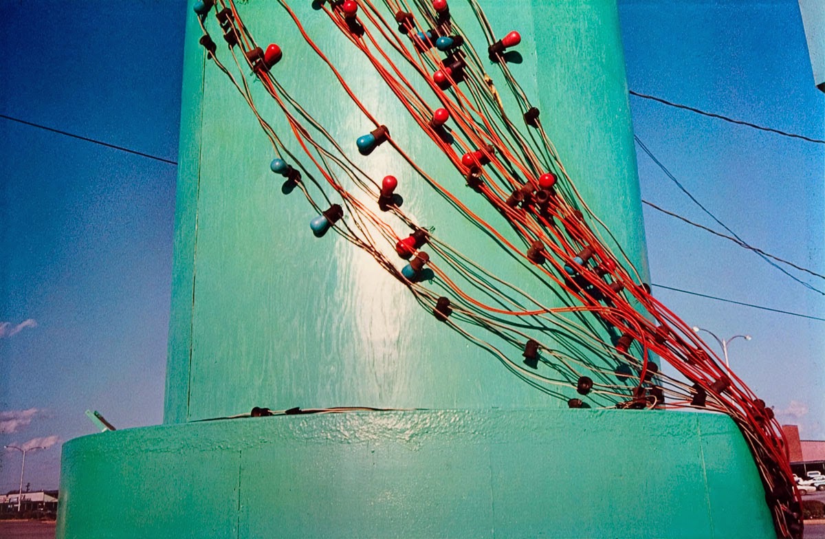
On the top image the wide range of colours is shown from the blue sky, a different colour building, all the different colours of the cars and signs and the green of the grass. This I think actually makes the image look really interesting to look at even though it is whats considered the "boring". This is the same with the second image there is a bright baby blue pole with wire wrapped around it, the wire also has little things on it, these are also a wide range of colour on these which also makes them stand out. This image also has some clouds in the sky, not many and off in one corner, but they also add some colour and with all its colour it makes it a really good photo, I really like it because of this.
On the top image the wide range of colours is shown from the blue sky, a different colour building, all the different colours of the cars and signs and the green of the grass. This I think actually makes the image look really interesting to look at even though it is whats considered the "boring". This is the same with the second image there is a bright baby blue pole with wire wrapped around it, the wire also has little things on it, these are also a wide range of colour on these which also makes them stand out. This image also has some clouds in the sky, not many and off in one corner, but they also add some colour and with all its colour it makes it a really good photo, I really like it because of this.
Proposal
For this project entitled Empirical Evidence I will be photographing the everyday life of mainly Burton I may if it I am able also Derby. I will also by photographing what is perceived as the boring like William Eggleston does but in my sort of style so that the images aren't too similar. I will be photographing this because this is something that I have never done before and it sounds quite interesting and when I did my first photo shoot it was really enjoyable.
As this is a location project, I won't have to book out the studio which will mean I won't have to wait to get photo shoots done, I can just go out onto location whenever I need to and this will speed up the process dramatically. In terms of where I am actually going, I will just be going around Burton and the places I will be going to will not need me to get any sort of permission before taking photos, but if I do need permission I will make sure that I do get it prior to shooting, if I can't get permission, I will just move on and shoot somewhere else instead. When it comes to the equipment that I need when I am at college I will be able to borrow a Canon 400D camera which I will be able to use I also have a 40D and 5D Mark III of my own that I can use at home if I need to do any shoots outside of college time. There isn't likely to be any risks in any of the shoots that I will be doing as I will not need to go to any places where risks will be taken to get the images.
With research I have looked into William Eggleston and I will also be looking into other photographers who have used a similar sort of style, I will also be looking into photographers who shoot the everyday life and street photographers, so that I can get some inspiration. I will ensure that I get photo shoots done as soon as possible so that I am not wasting time and that I am also not hurrying to get shoots done at the end of the project.

These are the sorts of images that I will be trying to achieve throughout the project, these are some of my early attempts.


These are some of William Eggleston's images that I hope will inspire me throughout the project and is what I am aiming for but with my own twist and take on them.
As this is a location project, I won't have to book out the studio which will mean I won't have to wait to get photo shoots done, I can just go out onto location whenever I need to and this will speed up the process dramatically. In terms of where I am actually going, I will just be going around Burton and the places I will be going to will not need me to get any sort of permission before taking photos, but if I do need permission I will make sure that I do get it prior to shooting, if I can't get permission, I will just move on and shoot somewhere else instead. When it comes to the equipment that I need when I am at college I will be able to borrow a Canon 400D camera which I will be able to use I also have a 40D and 5D Mark III of my own that I can use at home if I need to do any shoots outside of college time. There isn't likely to be any risks in any of the shoots that I will be doing as I will not need to go to any places where risks will be taken to get the images.
With research I have looked into William Eggleston and I will also be looking into other photographers who have used a similar sort of style, I will also be looking into photographers who shoot the everyday life and street photographers, so that I can get some inspiration. I will ensure that I get photo shoots done as soon as possible so that I am not wasting time and that I am also not hurrying to get shoots done at the end of the project.
These are the sorts of images that I will be trying to achieve throughout the project, these are some of my early attempts.
These are some of William Eggleston's images that I hope will inspire me throughout the project and is what I am aiming for but with my own twist and take on them.
Thursday 20 November 2014
Initial Photoshoot
For the initial photo shoot I went around different areas of Burton that were less busy to focus on was is perceived as the boring this was one of my best photo shoots I enjoyed photographing the unconventional items and things that I could find around Burton.
 Any little thing that I found that looked was is considered boring I photographed and I followed something else that William Eggleston does I decided to take just one photo of the item, this was on most photos. If the image didn't quite look right I did take another to try and get the photos right, but for most of the images I took one shot of each. It was something that I found really interesting and difficult at the same time. It was interesting as I had never photographed the "boring" before and this showed me what you can truly do with unconventional items and it is actually quite brilliant. It was also quite difficult because trying just to take one photo of a subject as you have just one chance at it and no redos.

During the entire time I found many different objects that could use and this really helped and I had such a wide range of images. I truly enjoyed this photo shoot I did and it has helped me for the rest of the assignment.
During the entire time I found many different objects that could use and this really helped and I had such a wide range of images. I truly enjoyed this photo shoot I did and it has helped me for the rest of the assignment.


Initial Ideas
- Everyday life
- Derby
- Burton
- Nighttime photography
- wide range of places
- different places to previous project
Friday 7 November 2014
Floating Images
The first mini task of this project was about creating a floating image, this was done by getting someone to lie on a table or stool and having them pose on it as if they were actually floating. Then, without moving the camera, the person and the stool moves and they take a photo of the background. After this it was edited in photoshop, by getting the blank background and overlaying the other image over it. The image with the person it is dragged to vector mask tool, before switching the colour at the colour box to black to ensure that when you use your brush tool it removes the stool and nothing else. After removing the stool some editing maybe needed to fix the colouring so that they match.
When it came to making my image the only problem that arose was trying to get the colours on the two photos right. This didn't take long to fix, I managed to fix it by using the levels, the burn tool and the clone stamp tool.

When it came to making my image the only problem that arose was trying to get the colours on the two photos right. This didn't take long to fix, I managed to fix it by using the levels, the burn tool and the clone stamp tool.
Introduction
This
project is entitled Empirical Evidence and will be based around documentary and
location photography. For this assignment we are required to produce at least
one final image, they must be from the following themes: photojournalism, which
can be the everyday or the unconventional, scientific or forensics or fictional
documentary.
For
this project we can use props to show proof of myths. We can also document the
everyday, which would mean going out and about and shooting the areas around us
over several days showing different areas and how it changes over these days. We
can also document the unconventional, which would be a more abstract side of
photography than if we were photographing the everyday and normal areas. This
would be a very good way to show of photography and Photoshop skills. It could
also be scientific photography, which would me collaborating with the science
department and taking photos of the different equipment that they have.
Prior
to doing this project, I can easily see that there is a lot that this project
can be based around.
Subscribe to:
Posts (Atom)