Laurent Roch is a multi-award winning French street photographer. Like Julien Legrand he shoots and reacts to what he sees and doesn't stage images. Again similar to Legrand he photographs the everyday but quite similar to William Eggleston, Roch looks for the unconventional in his photography.
This first image looks like a police barricade and one random kid has decided to have a look at it. I find this image interesting because the police seem to have a barricade up for some reason, but it seems that this one kid is the only person there which I find quite strange. This is one of those images that I couldn't see in colour. When you look at the image the main things that stand out are the boy and the word police. The word stands out because it is quite big on the screen and is quite central, the boy stand out as he is quite a large figure on the screen.
In this image it shows a man cycling past a building which has a painting of Marilyn Monroe on the side. The interesting thing I noticed about this image when you enlarge it does look like the painting is actually looking at the person cycling. This photo I do feel would look good in colour, but if the painting of Marilyn Monroe hasn't been done in colour then it is best to keep it in black and white. The main thing that stands out in this image is the painting of Marilyn Monroe because it is so prominent and covers most the page.
This image seems quite unconventional as it looks like Roch has decided to take a picture of people using a crossing but put the camera upside down to get this sort of image. I feel that this is probably the strongest image of the three mainly because of the unconventional way the image has been taken. It is easily one that should be in black and white and not colour. The location he has chosen is really good as you are more likely to get a fair few people to cross here. I think this is not only the best of the three, but one of Roch's best images.
Showing posts with label Research. Show all posts
Thursday, 4 December 2014
Julien Legrand
Julien Legrand is a French street photography who is known for a wide range of both colour and black and white images. Legrand is one of those photographers who's images are just spontaneous. He just takes his camera with him everywhere not looking for a specific image but waits for a suitable moment to shoot and regularly comes out with really strong and excellent images like those below.
This image seems to be either the opening of automatic doors or the opening or an underground. I think that this is a really good location to use as it has the doors and you can choose whether to use them or not and with Legrand using them it doesn't focus on the people and more on the door which makes it a really strong image. This is another image which I feel looks better in black and white. You can clearly tell that there are a few people in the shot but the best thing about this image is that yes you know they are there but there is more focus on the door than anything else.
With this image it looks a little bit like something has just exploded and the person at the front is running away from it. This gives it a more documentary look, but if the person wasn't in shot it would look like a more staged shot and not documenting the every day life. I feel that unlike the first and last image, this would probably work quite well in colour as well. It does also look like mist and the person is just casually walking past. Personally I do think that when I look close at an enlarged version of the photo, that it is just mist and the lady in shot is just walking past Legrand as he is taking the photo.
At first look this image does look like the man in the photo is asleep but when I looked at an enlarged version of the photo, it does actually look like he is laughing, but he does look like he has his eyes closed whilst waiting for the bus. I would have at one point wondered why he would take an image like this, but know I understand fully why he would take an image like this as clearly he is documenting the every day life of what I believe is Paris. I believe that all of the images here are showing the everyday life of Paris and to me these images show a wide range of things that go on during a normal day in Paris. These images and all of his others are quite strong and show that in Paris and all the other places he has shot in have a diverse range of subjects and activities going on during a typical day.
This image seems to be either the opening of automatic doors or the opening or an underground. I think that this is a really good location to use as it has the doors and you can choose whether to use them or not and with Legrand using them it doesn't focus on the people and more on the door which makes it a really strong image. This is another image which I feel looks better in black and white. You can clearly tell that there are a few people in the shot but the best thing about this image is that yes you know they are there but there is more focus on the door than anything else.
With this image it looks a little bit like something has just exploded and the person at the front is running away from it. This gives it a more documentary look, but if the person wasn't in shot it would look like a more staged shot and not documenting the every day life. I feel that unlike the first and last image, this would probably work quite well in colour as well. It does also look like mist and the person is just casually walking past. Personally I do think that when I look close at an enlarged version of the photo, that it is just mist and the lady in shot is just walking past Legrand as he is taking the photo.
At first look this image does look like the man in the photo is asleep but when I looked at an enlarged version of the photo, it does actually look like he is laughing, but he does look like he has his eyes closed whilst waiting for the bus. I would have at one point wondered why he would take an image like this, but know I understand fully why he would take an image like this as clearly he is documenting the every day life of what I believe is Paris. I believe that all of the images here are showing the everyday life of Paris and to me these images show a wide range of things that go on during a normal day in Paris. These images and all of his others are quite strong and show that in Paris and all the other places he has shot in have a diverse range of subjects and activities going on during a typical day.
Shin Noguchi
Shin Noguchi is a Japanese street photographer. Noguchi is based in Tokyo and Kamakura, this is where he takes a majority of his photos. Noguchi himself has said his tries to photograph the extraordinary. Noguchi is also part of the international photography group "Street Photographers"
In this image is shows a woman crossing the road, though it just shows her legs and feet. I feel that with it clear she is in a walking motion it kind of reminds me of the Abbey Road album cover by The Beatles with the crossing on the road. I feel that this is a very strong image as it just has a focus on one part of the woman.
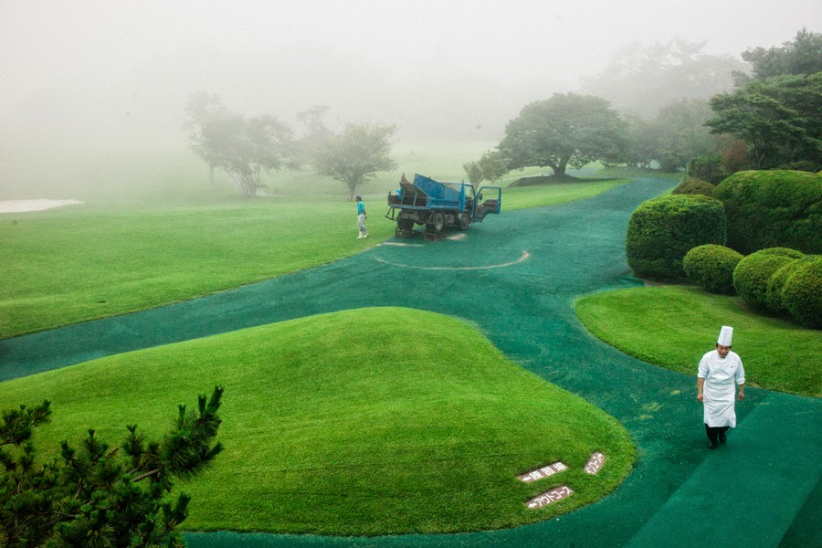
In this photo it shows a chef walking across what seems to be a golf course which makes me think that this is probably a country club. It has a very green look to it as the path is also a greeny blue colour, all the trees and bushes are also quite green and stand out and the machine in the background is a big green as well. I feel that with the mist at the back of this photo it makes it makes it a really strong image. I think that if the chef was in green as well it would be a great photo but I know that most chefs where white, but this wasn't something major that I would change.
In this image it shows a person, which I believe is a woman walking across a path with an umbrella covering their face and most of the top half of their body. It also has a couple of shadows which are in quite interesting places as it leaves a gap between the two and then the person is in probably the best place away from the shadows. This is why I feel this is another strong image.
In this image is shows a woman crossing the road, though it just shows her legs and feet. I feel that with it clear she is in a walking motion it kind of reminds me of the Abbey Road album cover by The Beatles with the crossing on the road. I feel that this is a very strong image as it just has a focus on one part of the woman.
In this photo it shows a chef walking across what seems to be a golf course which makes me think that this is probably a country club. It has a very green look to it as the path is also a greeny blue colour, all the trees and bushes are also quite green and stand out and the machine in the background is a big green as well. I feel that with the mist at the back of this photo it makes it makes it a really strong image. I think that if the chef was in green as well it would be a great photo but I know that most chefs where white, but this wasn't something major that I would change.
In this image it shows a person, which I believe is a woman walking across a path with an umbrella covering their face and most of the top half of their body. It also has a couple of shadows which are in quite interesting places as it leaves a gap between the two and then the person is in probably the best place away from the shadows. This is why I feel this is another strong image.
Friday, 28 November 2014
Umberto Verdoliva
Umberto Verdoliva is an Italian photographer who is best known for his street photography, he not only conducts street photography workshops but has his own group Spontanea which is dedicated to street photography.
In this photo it sees a person, which I believe is a woman cycling along a road. Like a lot of his images that I like it just has one person in it and a wide area of space around them. This image shows a lot of the area this person is cycling around, what I do like with not only this image but all of them is how you can just see the person as black and not any features of them are visible.
This cycling image I feel is the strong of the two as there is more going on in the photo you can see them at the roundabout. The actual person and bike is quite small in the photo as it shows a lot of the surrounding area and all the detail of the round and the roundabout and path markings as well which I really like. This is because it is not just a boring image of someone on a bike it has a lot more to it than just a bike and cyclist.
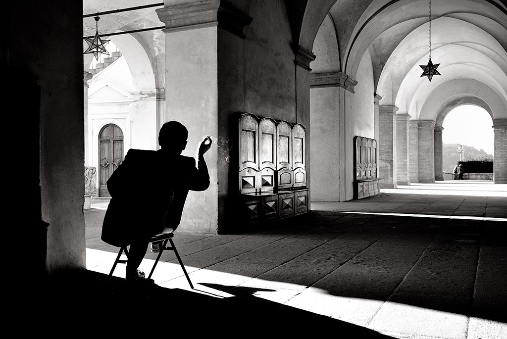
This image I also like as it just has one person sitting in a corridor and it shows the entire corridor which has a lot of detail to it. It has all the items on wall and the star hanging from the ceiling. The main thing I think people are wondering when you see this image is what is this good doing, I think that he is either drawing the corridor or maybe even having a smoke. All of the images are quite interesting and of course they look a lot better in black and white I feel than in colour.
In this photo it sees a person, which I believe is a woman cycling along a road. Like a lot of his images that I like it just has one person in it and a wide area of space around them. This image shows a lot of the area this person is cycling around, what I do like with not only this image but all of them is how you can just see the person as black and not any features of them are visible.
This cycling image I feel is the strong of the two as there is more going on in the photo you can see them at the roundabout. The actual person and bike is quite small in the photo as it shows a lot of the surrounding area and all the detail of the round and the roundabout and path markings as well which I really like. This is because it is not just a boring image of someone on a bike it has a lot more to it than just a bike and cyclist.
This image I also like as it just has one person sitting in a corridor and it shows the entire corridor which has a lot of detail to it. It has all the items on wall and the star hanging from the ceiling. The main thing I think people are wondering when you see this image is what is this good doing, I think that he is either drawing the corridor or maybe even having a smoke. All of the images are quite interesting and of course they look a lot better in black and white I feel than in colour.
Wednesday, 26 November 2014
Dimitri Mellos
Dimitri Mellos is a Greek photographer who is known for his street photography. Mellos would run around town pretending to take photographs when he was young, by using a camera not loaded with film.
In this photograph I feel that it is quite good as it focuses on the one person, it also has a man who has been blacked out at the side, which is quite distracting but also adds something to the photo, and I do feel that the image would look really odd without the shadow. You can tell that he would have been in quite close proximity to the people, but he would have been really close to the person who is very close to the camera. The main things you think when you look at this photo is what is she holding, which is a spoon and what are they looking at.
In this photograph it is showing a group of people who look like they are protesting against something. With the photo the people, the tape and the signs all have a wide range of colour on them which gives the photo a really good look to it. With this photo if you look carefully you can see that there is a wide range of ages in this photo which could mean that Mellos tried to find a area where there was a wide age group range or he just chose this area and was lucky that there was such a diverse age range. With the image, first things that come into mind are what are they protesting about and in my mind I was wondering what was the caution tape all about.
In this photo it has an elderly lady crossing the street and some people near her who look like they are trying to reenact a battle, but the lady is either oblivious to them or is ignoring them. This photo does have a lot of colour to it as the lady has a black dress on with loads of different colour spots, the people in the background also have a lot of different colours on their shields and helmets. Looking close at it and at her facial expression she is fully aware that there are there and she doesn't look amused by them. The main thing you wonder when looking at this photo is are they trying to recreate a battle and she's got in the way or are they trying to advertise something. I do also like how he has taken the image at a titled angle it makes it look different to an ordinary photo and gets more into shot.
In this photograph I feel that it is quite good as it focuses on the one person, it also has a man who has been blacked out at the side, which is quite distracting but also adds something to the photo, and I do feel that the image would look really odd without the shadow. You can tell that he would have been in quite close proximity to the people, but he would have been really close to the person who is very close to the camera. The main things you think when you look at this photo is what is she holding, which is a spoon and what are they looking at.
In this photograph it is showing a group of people who look like they are protesting against something. With the photo the people, the tape and the signs all have a wide range of colour on them which gives the photo a really good look to it. With this photo if you look carefully you can see that there is a wide range of ages in this photo which could mean that Mellos tried to find a area where there was a wide age group range or he just chose this area and was lucky that there was such a diverse age range. With the image, first things that come into mind are what are they protesting about and in my mind I was wondering what was the caution tape all about.
In this photo it has an elderly lady crossing the street and some people near her who look like they are trying to reenact a battle, but the lady is either oblivious to them or is ignoring them. This photo does have a lot of colour to it as the lady has a black dress on with loads of different colour spots, the people in the background also have a lot of different colours on their shields and helmets. Looking close at it and at her facial expression she is fully aware that there are there and she doesn't look amused by them. The main thing you wonder when looking at this photo is are they trying to recreate a battle and she's got in the way or are they trying to advertise something. I do also like how he has taken the image at a titled angle it makes it look different to an ordinary photo and gets more into shot.
Friday, 21 November 2014
William Eggleston
William Eggleston is an American photographer who is known for photographing what is perceived as the "boring". Despite this Eggleston has still created some brilliant and iconic images he is also
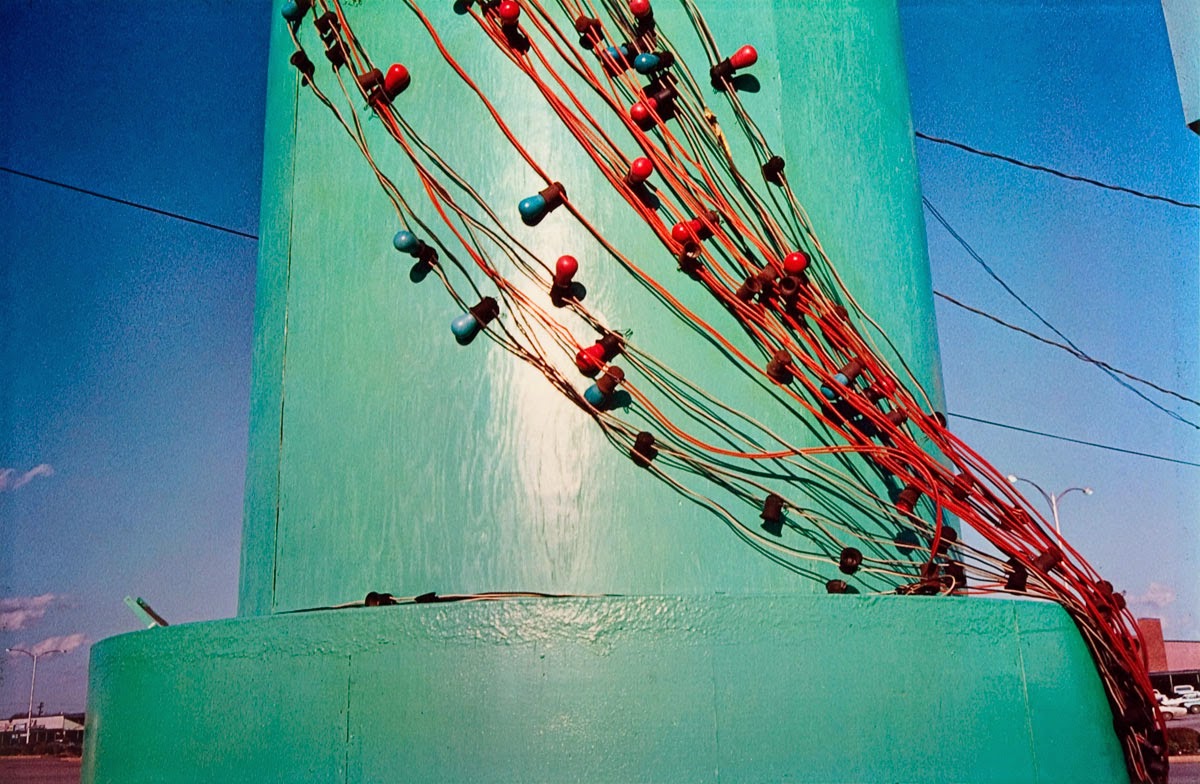
considered on of the greats in photography. Eggleston was born and has spent his entire life in Memphis, Tennessee. If you look over his photos those that are in colour he has used a wide range of colours which really do stand out. On the two photos taken outside the building on the top image and the pole on the bottom have similar shades of blue. The top image is more than likely an older image as some of the parked cars on the image do look quite old and it could have been taken in the 1960s or later. The other was taken during filming for a DVD that we saw when Eggleston was quite a bit older and was probably taken in the last five years or so.
On the top image the wide range of colours is shown from the blue sky, a different colour building, all the different colours of the cars and signs and the green of the grass. This I think actually makes the image look really interesting to look at even though it is whats considered the "boring". This is the same with the second image there is a bright baby blue pole with wire wrapped around it, the wire also has little things on it, these are also a wide range of colour on these which also makes them stand out. This image also has some clouds in the sky, not many and off in one corner, but they also add some colour and with all its colour it makes it a really good photo, I really like it because of this.
considered on of the greats in photography. Eggleston was born and has spent his entire life in Memphis, Tennessee. If you look over his photos those that are in colour he has used a wide range of colours which really do stand out. On the two photos taken outside the building on the top image and the pole on the bottom have similar shades of blue. The top image is more than likely an older image as some of the parked cars on the image do look quite old and it could have been taken in the 1960s or later. The other was taken during filming for a DVD that we saw when Eggleston was quite a bit older and was probably taken in the last five years or so.
On the top image the wide range of colours is shown from the blue sky, a different colour building, all the different colours of the cars and signs and the green of the grass. This I think actually makes the image look really interesting to look at even though it is whats considered the "boring". This is the same with the second image there is a bright baby blue pole with wire wrapped around it, the wire also has little things on it, these are also a wide range of colour on these which also makes them stand out. This image also has some clouds in the sky, not many and off in one corner, but they also add some colour and with all its colour it makes it a really good photo, I really like it because of this.
Subscribe to:
Posts (Atom)