Throughout this project to date I have gone on three different photo shoots, taking over 30 photos each time. I would say that the first shoot I did was probably the one I was most pleased with as nearly every single image came out the way I wanted to and like I had set out to do, they were taken in one shot. The second shoot did produce the most images that I could use as a final piece or even in my portfolio, but this shoot wasn't the best as there were a fair few images that weren't very good and had to be taken a couple of times before I got it right.
The first shoot I took over 50 images, this shoot was the best as it produced a wide range of images, that I really liked. This shoot I feel went well mainly because practically every image came out right, but the second shoot I thought had more photos that I felt were strong and could be used as final images. The shoot produced the Pespi can image which is one I like as it isn't really something other people would even consider taking a photo of. I like how the can was just there on the ledge which I also found interesting. There was also a can of Dr. Pepper sat on the ledge on the other side.
The second shoot did provide me with another 12 images, this was just a short shoot later on in the day, after the first this was just to get a couple more images. I think that even though I took just 12 images, I think easily 8-10 of them could be used as a final pieces and three or four of them could even be added to my portfolio. This shoot produced the top two images on this page, which I do feel are quite strong images. The bike lock is as there is other things to focus on besides the bike lock, and the leaves have a really good texture to them, which is kind of slimy. The water droplets I also feel is a really good image as it focus on the drops and the pole there are coming off, and not on any of the background and it has a brilliant narrow depth of field
My third photo shoot was easily the weakest of the three, but even though it did produce several good, strong images, the level of the previous two shoots meant that they just weren't good enough. This shoot produced a further 32 images, all of which I probably would have used had it not been for the previous two shoots. The third shoot produced the bottom image, which I do like quite a bit but because of what I had produced in the previous two shoots, I am not really sure that it is on par with the other images that I had already produced for this project.
Overall of the 100 or so images that I took I feel really pleased that I managed to produce in my opinion 60-70 strong images that I could use in this project and because of this it will make choosing my final images quite difficult, I do have in mind a couple that I could use. One I feel I may use as a final, is the top image from this page. I will also look for at least 2 or 3 more for finals I intend to go out on one or two more shoots to reach around 150 to 200 images and then I should be able to pick some final images, hopefully I may end up with four or five final images.
Friday, 5 December 2014
Thursday, 4 December 2014
Photo Shoot 3
For this I continued documenting the unconventional around Burton, but this time I went to different locations so try and find a wide range of images that I could use and this shoot probably wasn't my best, but I still managed to get some pretty good images that could be used as one of my finals.
With this image I tried to get the entire lock and get some of the detail of the rust and get some of the pole it was on as well, which I feel I did. I did give this a few more attempts, to try and get plenty of rust, but I do feel that of the others I took of this lock, this is probably the best of the three or four I took of the lock. I am quite happy with how this image came out as it has the narrow depth of field, and it focuses perfectly on the lock and pole which is exactly what I was looking for.
This image I took when I was helping Sammy with one of her shoots, I just this cloth hanging off a branch and instantly thought that it could make a really good photo as it is very unconventional and I feel that this image came out really well. I feel that the main thing that helped this image be a strong image is the colouring of the leaves of the branch that the cloth is hanging off.
This photo was a little bit of luck really, I was again helping Sammy with her shoot and she threw her goggles and they landed like this which I feel looks really random and out of place which I really liked. This continued a pattern of images where I just had one attempt to get the right image, which I feel I did here with the one photo and I am really glad it worked.
With this image I tried to get the entire lock and get some of the detail of the rust and get some of the pole it was on as well, which I feel I did. I did give this a few more attempts, to try and get plenty of rust, but I do feel that of the others I took of this lock, this is probably the best of the three or four I took of the lock. I am quite happy with how this image came out as it has the narrow depth of field, and it focuses perfectly on the lock and pole which is exactly what I was looking for.
This image I took when I was helping Sammy with one of her shoots, I just this cloth hanging off a branch and instantly thought that it could make a really good photo as it is very unconventional and I feel that this image came out really well. I feel that the main thing that helped this image be a strong image is the colouring of the leaves of the branch that the cloth is hanging off.
This photo was a little bit of luck really, I was again helping Sammy with her shoot and she threw her goggles and they landed like this which I feel looks really random and out of place which I really liked. This continued a pattern of images where I just had one attempt to get the right image, which I feel I did here with the one photo and I am really glad it worked.
Laurent Roch
Laurent Roch is a multi-award winning French street photographer. Like Julien Legrand he shoots and reacts to what he sees and doesn't stage images. Again similar to Legrand he photographs the everyday but quite similar to William Eggleston, Roch looks for the unconventional in his photography.
This first image looks like a police barricade and one random kid has decided to have a look at it. I find this image interesting because the police seem to have a barricade up for some reason, but it seems that this one kid is the only person there which I find quite strange. This is one of those images that I couldn't see in colour. When you look at the image the main things that stand out are the boy and the word police. The word stands out because it is quite big on the screen and is quite central, the boy stand out as he is quite a large figure on the screen.
In this image it shows a man cycling past a building which has a painting of Marilyn Monroe on the side. The interesting thing I noticed about this image when you enlarge it does look like the painting is actually looking at the person cycling. This photo I do feel would look good in colour, but if the painting of Marilyn Monroe hasn't been done in colour then it is best to keep it in black and white. The main thing that stands out in this image is the painting of Marilyn Monroe because it is so prominent and covers most the page.
This image seems quite unconventional as it looks like Roch has decided to take a picture of people using a crossing but put the camera upside down to get this sort of image. I feel that this is probably the strongest image of the three mainly because of the unconventional way the image has been taken. It is easily one that should be in black and white and not colour. The location he has chosen is really good as you are more likely to get a fair few people to cross here. I think this is not only the best of the three, but one of Roch's best images.
This first image looks like a police barricade and one random kid has decided to have a look at it. I find this image interesting because the police seem to have a barricade up for some reason, but it seems that this one kid is the only person there which I find quite strange. This is one of those images that I couldn't see in colour. When you look at the image the main things that stand out are the boy and the word police. The word stands out because it is quite big on the screen and is quite central, the boy stand out as he is quite a large figure on the screen.
In this image it shows a man cycling past a building which has a painting of Marilyn Monroe on the side. The interesting thing I noticed about this image when you enlarge it does look like the painting is actually looking at the person cycling. This photo I do feel would look good in colour, but if the painting of Marilyn Monroe hasn't been done in colour then it is best to keep it in black and white. The main thing that stands out in this image is the painting of Marilyn Monroe because it is so prominent and covers most the page.
This image seems quite unconventional as it looks like Roch has decided to take a picture of people using a crossing but put the camera upside down to get this sort of image. I feel that this is probably the strongest image of the three mainly because of the unconventional way the image has been taken. It is easily one that should be in black and white and not colour. The location he has chosen is really good as you are more likely to get a fair few people to cross here. I think this is not only the best of the three, but one of Roch's best images.
Julien Legrand
Julien Legrand is a French street photography who is known for a wide range of both colour and black and white images. Legrand is one of those photographers who's images are just spontaneous. He just takes his camera with him everywhere not looking for a specific image but waits for a suitable moment to shoot and regularly comes out with really strong and excellent images like those below.
This image seems to be either the opening of automatic doors or the opening or an underground. I think that this is a really good location to use as it has the doors and you can choose whether to use them or not and with Legrand using them it doesn't focus on the people and more on the door which makes it a really strong image. This is another image which I feel looks better in black and white. You can clearly tell that there are a few people in the shot but the best thing about this image is that yes you know they are there but there is more focus on the door than anything else.
With this image it looks a little bit like something has just exploded and the person at the front is running away from it. This gives it a more documentary look, but if the person wasn't in shot it would look like a more staged shot and not documenting the every day life. I feel that unlike the first and last image, this would probably work quite well in colour as well. It does also look like mist and the person is just casually walking past. Personally I do think that when I look close at an enlarged version of the photo, that it is just mist and the lady in shot is just walking past Legrand as he is taking the photo.
At first look this image does look like the man in the photo is asleep but when I looked at an enlarged version of the photo, it does actually look like he is laughing, but he does look like he has his eyes closed whilst waiting for the bus. I would have at one point wondered why he would take an image like this, but know I understand fully why he would take an image like this as clearly he is documenting the every day life of what I believe is Paris. I believe that all of the images here are showing the everyday life of Paris and to me these images show a wide range of things that go on during a normal day in Paris. These images and all of his others are quite strong and show that in Paris and all the other places he has shot in have a diverse range of subjects and activities going on during a typical day.
This image seems to be either the opening of automatic doors or the opening or an underground. I think that this is a really good location to use as it has the doors and you can choose whether to use them or not and with Legrand using them it doesn't focus on the people and more on the door which makes it a really strong image. This is another image which I feel looks better in black and white. You can clearly tell that there are a few people in the shot but the best thing about this image is that yes you know they are there but there is more focus on the door than anything else.
With this image it looks a little bit like something has just exploded and the person at the front is running away from it. This gives it a more documentary look, but if the person wasn't in shot it would look like a more staged shot and not documenting the every day life. I feel that unlike the first and last image, this would probably work quite well in colour as well. It does also look like mist and the person is just casually walking past. Personally I do think that when I look close at an enlarged version of the photo, that it is just mist and the lady in shot is just walking past Legrand as he is taking the photo.
At first look this image does look like the man in the photo is asleep but when I looked at an enlarged version of the photo, it does actually look like he is laughing, but he does look like he has his eyes closed whilst waiting for the bus. I would have at one point wondered why he would take an image like this, but know I understand fully why he would take an image like this as clearly he is documenting the every day life of what I believe is Paris. I believe that all of the images here are showing the everyday life of Paris and to me these images show a wide range of things that go on during a normal day in Paris. These images and all of his others are quite strong and show that in Paris and all the other places he has shot in have a diverse range of subjects and activities going on during a typical day.
Shin Noguchi
Shin Noguchi is a Japanese street photographer. Noguchi is based in Tokyo and Kamakura, this is where he takes a majority of his photos. Noguchi himself has said his tries to photograph the extraordinary. Noguchi is also part of the international photography group "Street Photographers"
In this image is shows a woman crossing the road, though it just shows her legs and feet. I feel that with it clear she is in a walking motion it kind of reminds me of the Abbey Road album cover by The Beatles with the crossing on the road. I feel that this is a very strong image as it just has a focus on one part of the woman.
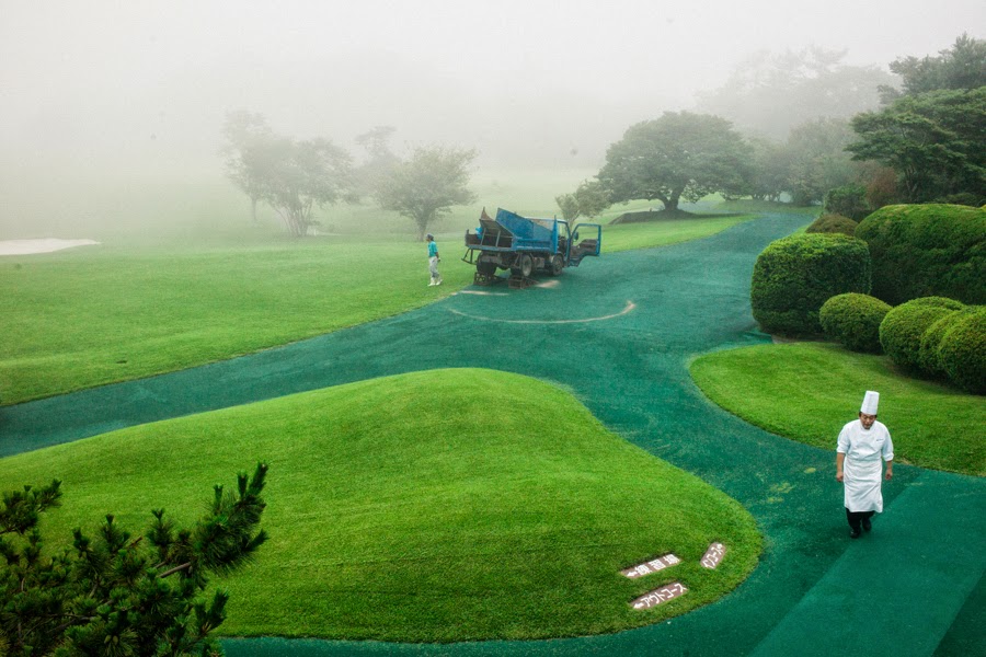
In this photo it shows a chef walking across what seems to be a golf course which makes me think that this is probably a country club. It has a very green look to it as the path is also a greeny blue colour, all the trees and bushes are also quite green and stand out and the machine in the background is a big green as well. I feel that with the mist at the back of this photo it makes it makes it a really strong image. I think that if the chef was in green as well it would be a great photo but I know that most chefs where white, but this wasn't something major that I would change.
In this image it shows a person, which I believe is a woman walking across a path with an umbrella covering their face and most of the top half of their body. It also has a couple of shadows which are in quite interesting places as it leaves a gap between the two and then the person is in probably the best place away from the shadows. This is why I feel this is another strong image.
In this image is shows a woman crossing the road, though it just shows her legs and feet. I feel that with it clear she is in a walking motion it kind of reminds me of the Abbey Road album cover by The Beatles with the crossing on the road. I feel that this is a very strong image as it just has a focus on one part of the woman.
In this photo it shows a chef walking across what seems to be a golf course which makes me think that this is probably a country club. It has a very green look to it as the path is also a greeny blue colour, all the trees and bushes are also quite green and stand out and the machine in the background is a big green as well. I feel that with the mist at the back of this photo it makes it makes it a really strong image. I think that if the chef was in green as well it would be a great photo but I know that most chefs where white, but this wasn't something major that I would change.
In this image it shows a person, which I believe is a woman walking across a path with an umbrella covering their face and most of the top half of their body. It also has a couple of shadows which are in quite interesting places as it leaves a gap between the two and then the person is in probably the best place away from the shadows. This is why I feel this is another strong image.
Friday, 28 November 2014
Umberto Verdoliva
Umberto Verdoliva is an Italian photographer who is best known for his street photography, he not only conducts street photography workshops but has his own group Spontanea which is dedicated to street photography.
In this photo it sees a person, which I believe is a woman cycling along a road. Like a lot of his images that I like it just has one person in it and a wide area of space around them. This image shows a lot of the area this person is cycling around, what I do like with not only this image but all of them is how you can just see the person as black and not any features of them are visible.
This cycling image I feel is the strong of the two as there is more going on in the photo you can see them at the roundabout. The actual person and bike is quite small in the photo as it shows a lot of the surrounding area and all the detail of the round and the roundabout and path markings as well which I really like. This is because it is not just a boring image of someone on a bike it has a lot more to it than just a bike and cyclist.
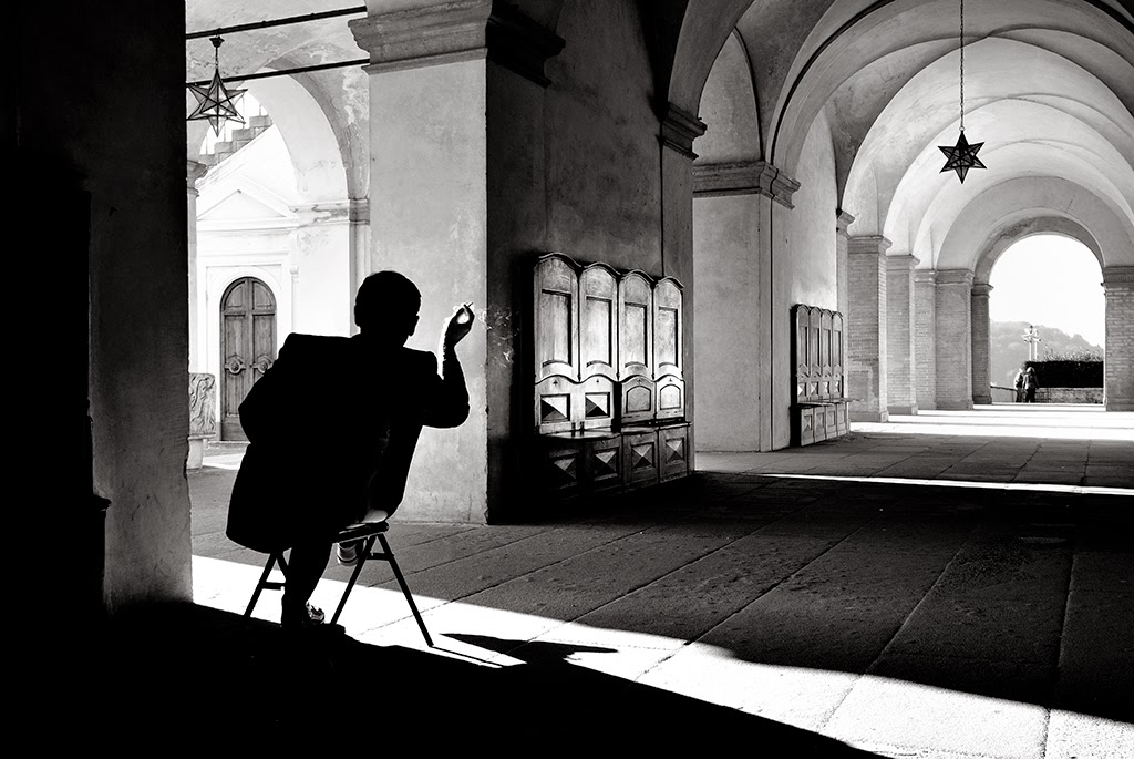
This image I also like as it just has one person sitting in a corridor and it shows the entire corridor which has a lot of detail to it. It has all the items on wall and the star hanging from the ceiling. The main thing I think people are wondering when you see this image is what is this good doing, I think that he is either drawing the corridor or maybe even having a smoke. All of the images are quite interesting and of course they look a lot better in black and white I feel than in colour.
In this photo it sees a person, which I believe is a woman cycling along a road. Like a lot of his images that I like it just has one person in it and a wide area of space around them. This image shows a lot of the area this person is cycling around, what I do like with not only this image but all of them is how you can just see the person as black and not any features of them are visible.
This cycling image I feel is the strong of the two as there is more going on in the photo you can see them at the roundabout. The actual person and bike is quite small in the photo as it shows a lot of the surrounding area and all the detail of the round and the roundabout and path markings as well which I really like. This is because it is not just a boring image of someone on a bike it has a lot more to it than just a bike and cyclist.
This image I also like as it just has one person sitting in a corridor and it shows the entire corridor which has a lot of detail to it. It has all the items on wall and the star hanging from the ceiling. The main thing I think people are wondering when you see this image is what is this good doing, I think that he is either drawing the corridor or maybe even having a smoke. All of the images are quite interesting and of course they look a lot better in black and white I feel than in colour.
Subscribe to:
Posts (Atom)